The Long and the Short of It: questions and problems
OK, so let’s look at some of the very puzzling data and charts in “The Long and the Short of It”. Don’t let these questions detract from the value of the principles the report reveals. The message is undoubtedly right. But some of the data. Well, let’s take a look.
The Long and the Short of It dataset
“The Long and the Short of It” is based on the results of 996 advertising campaigns entered into the IPA’s national and international effectiveness competition between 1980 to 2010 (p10). That sounds like a big number but it’s actually a small dataset. Over 30 years, that’s only about 30 campaigns per year.
The Long and the Short of It seems to use a lot of data. But does it?
If it’s only based on competition entries it’ll be biased against campaigns that didn’t work. Agencies and their clients don’t enter competitions with failed campaigns. Consequently, the charts that say ‘x% of campaigns showed successful results’ will be way out. They should actually say ‘x% of the successful campaigns we know about showed successful results’. There could be lots of other campaigns that used the same technique that didn’t work.
We don’t even know if it’s safe to say the database represents all successful campaigns. Collating the data, the background information and making a submission is an investment of time some agencies/companies may not be willing to make.
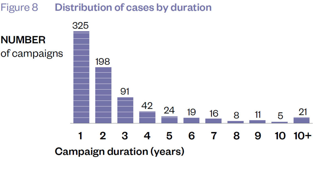
Only 237 of the campaigns ran for three years or more (Figure 8). This is critical for any report comparing long-term to short-term effects. 237 campaigns in 30 years; that’s about 8 campaigns a year. Is that not considered a tiny dataset?
The Long and the Short of It has surprisingly little long-term data
Presentation of data in The Long and the Short of It
I remember from my ‘O’ Level Mathematics (yes, I predate GCSEs) that when you present percentages, the axis goes to 100. The clue’s in the name, “per cent.”
If you’re not going to observe that rule, then don’t you at least have to make sure that graphs comparing similar data use the same scale? But that’s not how charts are presented in this report.
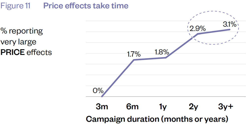
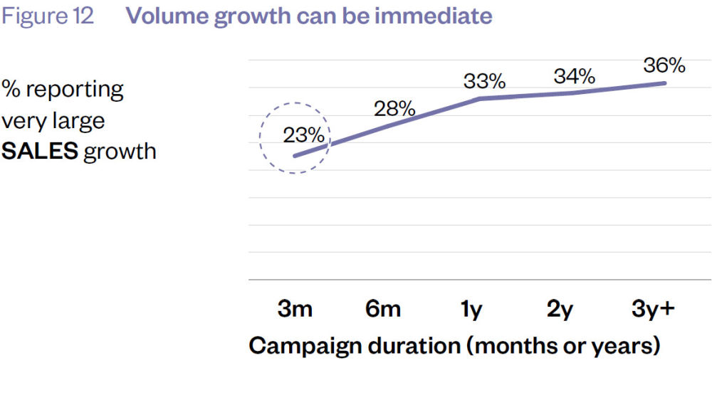
Figures 11, 12 and 13 (p19) place the high point of the percentage axes at about 4%, 40% and 18% respectively. And yet they’re trying to present the effect of multi-year campaigns on price, sales quantity and profit respectively. The data is charted like this:
This is how The Long and the Short of It presents campaigns’ effect on price over 3+ years
This is how The Long and the Short of It presents campaigns’ effect on sales over 3+ years
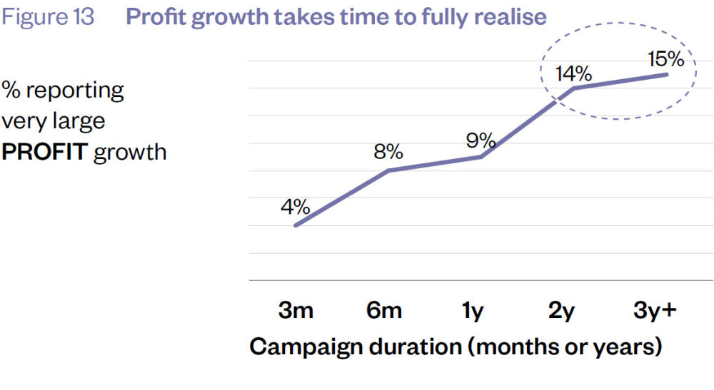
This is how The Long and the Short of It presents campaigns’ effect on profit over 3+ years
Presenting data in this way creates a visual impression that’s contrary to the underlying data. If you plot that data consistently between the variables, this is what it looks like:

When you see the data like this, you reach some conclusions that are NOT discussed by Binet & Field:
- Over 60% of these successful campaigns do NOT show very large price, sales or profit effects even after 3 years.
- Only a TINY proportion of campaigns show very large price effects, even after 3 years.
- That number hardly grows over those 3 years. You can only make it seem to grow using a short scale on your chart (Figure 11).
- It’s hard to agree with the conclusion on price effects that “after 3 years the percentage of campaigns reporting is still rising strongly.” It went from 2.9% to 3.1%. That’s about as strong as a wet tissue.
- If your goal was to have a very large price effect, how many people would adopt a campaign strategy that took 3 years to work 3% of the time (i.e. it DIDN’T work 97% of the time)?
- If your goal was to have a very large profit effect, how many people would adopt a campaign strategy that took 3 years to work 15% of the time (i.e. it DIDN’T work 85% of the time)?
Presenting data this way might help a marketing department work out which activity or channel works best for them. But it puts us at risk of over-promotion. Figure 40, for example, shows TV and posters as being the channels with the strongest effect on brand uplift. But it’s still only 27%. That should be presented like this:
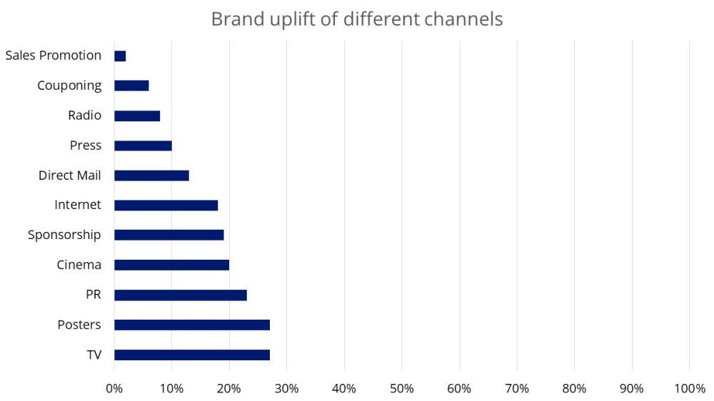
Not this:

The data’s the same but it creates a very different impression.
What puzzles me is why this data is accepted in this format. I’m a pimple of the backside of the marketing industry. Binet and Field are industry luminaries. So why is it me pointing this out?
Making the data fit the conclusions
I love reading whodunnit thrillers. There’s a common theme that the good cops always follow: let the evidence lead you to the criminal. Don’t fixate on a criminal and try to make the evidence fit them.
The principle came to mind when reading “The Long and Short of It”. What, I kept asking myself, do they think represents a success?
I’ve already mentioned the curious case of Figure 11 (p19) which promotes a move from 2.9% to 3.1% as evidence of strong growth. It makes you wonder what weak growth must look like.
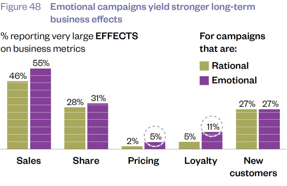
There are equally strange conclusions drawn from other data too. Look at Figure 48. This compares the relative effect of emotional and rational campaigns on metrics like price and sales. The benefit of emotional campaigns on pricing and loyalty is promoted (described as “doubled”) whereas their effect on sales and share are down-played (described as “only marginally increased”).
That’s one way of looking at the data. Alternatively, you could note that:
- 5% emotional campaigns had a large effect on pricing, but only 2% of rational campaigns. Yes, that’s (more than) double but it’s also just a 3% difference.
- 11% emotional campaigns had a large effect on loyalty, but only 5% of rational campaigns. Yes, that’s (more than) double again but it’s also just a 6% difference.
- 55% emotional campaigns had a large effect on pricing but only 46% rational campaigns had a similar effect. That’s not double, but it’s still a 9% difference which makes it strange to describe the difference as “marginal”.
- 31% emotional campaigns had a large effect on pricing, 28% rational campaigns had a similar effect. That’s not double, but it’s still a 3% difference – the same difference that was promoted when we were looking at price.
We also have to wonder how many campaigns we’re talking about. We’re talking long-term so presumably that means 3 years or more. There are only 237 of them in the databank. How many of those were classified as emotional? We don’t know. Whatever that number is, only 5% of them had a large effect on pricing. Are we talking about less than 10 campaigns? In 30 years?
Tying the numbers together
Binet and Field suggest that a business gains Share of Market at a rate of 0.05 times its Excess Share of Voice. So, if it has 1% more Share of Voice than its competitors this will develop into an extra 0.05% Share of Market. Or, as they put it, the business would need 20% Excess Share of Voice to get an extra 1% Share of Market.
This begs the question “is it worth it?” If you’re not entrenched in the marketing industry, you’d want to compare the cost of getting 1% Excess Share of Voice with the profit from 0.05% Share of Market.
Cutting too fine
Section 3 (from page 60) starts a discussion about types of emotional campaigns: fame or emotional involvement. And remember that emotional campaigns are just one category campaign in the database. The problem is that the database isn’t that big to begin with. It brings a saying to mind:
“When you cut a loaf, you get slices. When you cut too fine, you get crumbs.”
The small dataset is acknowledged when discussing fame campaigns (Figure 60). But the caveat takes a bizarre twist. The reports says “the absolute levels may be low, but this is because price elasticity is seldom measured”. This invites us to assume that a bigger dataset would reinforce the conclusion. But it could contradict it too.
If I did a survey on your favourite members of the Spice Girls and asked about Scary, Sporty, Posh and Baby – and then said “but respondents would have picked the fifth Spice if I could remember who she was” you’d laugh me out of court. You can’t draw conclusions from data that isn’t there.
Well, I didn’t think you could.
(And yes, I have been reminded that I forgot Ginger).
Causation, the big unknown
We don’t know whether the report searched for any alternative causation for long-term business effects. With short-term effects, you’re relatively safe (maybe) saying A lead to B because there wasn’t enough time for much else to happen.
But during a long-term, 3-year campaign lots of things can happen to a company, its market, the national or global economy. A lot of these campaigns were happening during the recovery from the 2008 financial crisis and the run-up to the 2016 Brexit vote. Turbulent times.
Business effects such as sales, profit and price sensitivity would have been affected.
There’s more to life
The report draws on research that demonstrates how automatic, emotional or fast factors influence decision-making more strongly than cognitive, slow factors. That’s one of the reasons that emotional brand building generates better long-term results.
This thinking encourages us to ignore other automatic, emotional or fast factors that affect purchasing. Factors that have nothing to do with brand or even marketing. Factors that may be even more influential.
- A purchase could be automatic, emotional or fast because it’s geographically convenient (I can get A from BargainBase while I’m buying B).
- A purchase could be automatic, emotional or fast because it’s domestically convenient (if I get B instead of A I’ll get grief from my son).
- A purchase could be automatic, emotional or fast because it’s channel(-brand) convenient (I’ll buy A from the farm shop because I trust the farm shop).
If we accept the premise that we should focus on automatic and emotional factors, we must remember that brand is just one of the levers we should be pulling.
In summary
You’ll be glad you’ve read “The Long and the Short of It”. It’ll either reveal or reinforce a long and short-term way of thinking that’ll benefit your business.
But you’ll also be a little worried if you read it carefully. Its nature and source data mean that it looks at marketing activity in isolation. Does it adequately take into account other changes in a business (e.g. new channel partners/distribution, personnel management/training) or an industry (e.g. shifts or declines in competitors) or an economy (e.g. end of recession)?
It left me uncomfortable between two extremes. You have Trumps on the one extreme, people who won’t believe anything unless if conforms to their world view. And you have researchers and academics on the other, people who extract more conclusions from data than are really there.
And in the middle you have the rest of us, desperately keen to base our decisions on fact and reason but uncomfortable with the facts we’re given.
Getting “The Long and the Short of It”
It’s unclear to us if the study is still something you have to buy. The IPA still sells it but a quick Google search shows that it’s also available for free from https://jeanallary.files.wordpress.com/2016/07/the_long_and_short_of_it_pdf_doc.pdf. This link sits at #1 in the Google rankings so it’s hardly a secret.