Perceptual maps show how you compare to your competitors
Perceptual maps are a quick and easy way to get a deep understanding of how you compare to your competitors. Most competitor comparisons are pretty dry and statistical: revenue, profit or market share. While this is a great way to see how you stack up it only tells you what the situation is, not why. Perceptual maps provide the why.
The idea behind a perceptual map is that it tells you how your customers and other people in the market perceive you. The clue’s in the name. It’s about perception, not reality. When you understand how you’re perceived you can begin to understand why you have the levels of revenue, profit or market share that you do.
As a simple example, a perceptual map helps you understand how you compare on price, service, expertise, sustainability or any other attribute you care to measure.
2D Perceptual Maps
Even if you don’t recognise the term “perceptual map” you will recognise its most basic form, the 2D perceptual map. This is the actual example used by Steve Jobs when he launched the iPhone to Apple’s devoted followers:
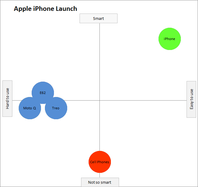
Steve Jobs used a very basic 2D perceptual map at the launch of the iPhone.
You can see that the concept of a 2D perceptual map is very simple. You compare how several different products perform according to 2 different attributes. In the iPhone example, the two attributes were smartness and ease-of-use.
If a technique is good enough for Steve Jobs it’s usually good enough for us mere mortals. But in this case, it isn’t.
The problem with a 2D perceptual map is that it can only compare two attributes. It’s hard to think of a situation in which you’d only want to compare yourself to your competitors according to 2 attributes. There are lots of attributes that matter. I already mentioned four earlier: price, expertise, sustainability and service. Even if you only compared these four, you’d need to produce six charts to see how they interacted with each other:
- price v service.
- price v expertise.
- price v sustainability.
- service v expertise.
- service v sustainability.
- expertise v sustainability.
Then you’d have to juggle the relative importance of each. Is price versus service more important than service versus expertise? Can you imagine presenting that at a Board meeting? By the time you’re showing the third chart, they’ve completely forgotten the point of the first.
Using 3D Perceptual Maps.
It’s far better to use 3D perceptual maps. They look like this:
3D perceptual maps plot everything you need on one chart.
A 3D perceptual map puts all the attributes you’re testing and all your competitors into a single chart. By comparing your proximity to the attributes, you can understand
- which attributes you own (or your competitors own); and
- which attributes you share with your competitors; and
- which attributes you’re contesting.
How to interpret a 3D perceptual map.
When you generate a 3D perceptual map from Excel (more on how to do that later) you get a chart that just plots you, your competitors and the attributes you’re testing. Excel doesn’t add the circles, arrows and labels. That’s up to you.
This is the kind of chart that Excel generates:

Excel produces the charts. You add the interpretation to your perceptual maps.
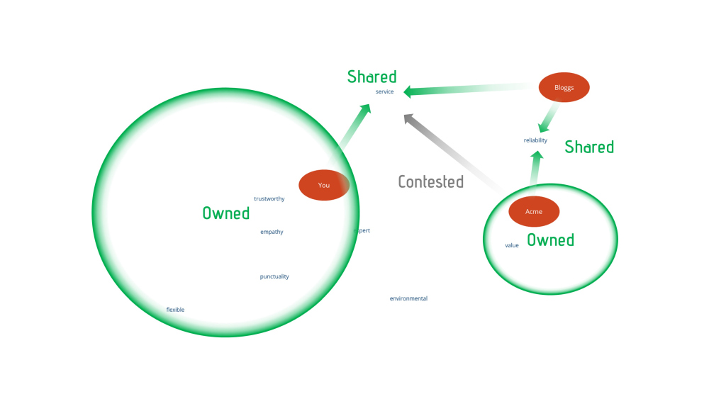
Once you understand what the chart is telling you, you say which attributes are owned, shared and contested. The interpretation isn’t usually difficult. It’s all about proximity. In the second illustration:
- It’s easy to see that the attributes trustworthy, empathy, expert, punctuality and flexible are far closer to “You” than your two competitors. You can say these attributes are owned by you.
- It’s also easy to see that service is equidistant between You and Bloggs. Environmental is equidistant between You and Acme. This means both of those attributes are shared.
- When you look more closely you can also see that Acme is not much further away from service than You and Bloggs. It’s therefore reasonable to say that while You and Bloggs share the attribute, Acme is contesting it.
How to produce a 3D perceptual map.
Although it looks complicated, producing a 3D perceptual map is very easy thanks to an Australian marketing professor called Geoff Fripp. He’s produced an Excel template that makes the process very simple. And it’s free to download on this link.
The beauty of Geoff’s template is that it leads you through all the steps you need to follow in a very simple fashion. You need to install a couple of Excel tools that aren’t part of a default installation (e.g. Solver) but, if you’re comfortable with Excel, you won’t find this process a challenge.
Once you’ve opened the template, all you do is enter the averages of the scores you get from your interviews with customers into the worksheet. You’ll notice that you have to do delete the demonstration scores for soft drinks first.
How to produce an even better 3D perceptual map.
I love people like Geoff Fripp who make everybody’s life easier. But that doesn’t necessarily mean that what they do is exactly what I want. So I made a couple of changes to his template:
- I spruced up the presentation so it looks a bit nicer. For example, in my template there’s a far bigger visual difference between the brands and the attributes being tested.
- I added another macro that lets you export the charts in JPG, PNG and PDF formats. This means you can import them into any presentation or report that you’re producing. The macro is called “ExportChartsAsPDF_JPG_PNG()”.
You can download my version of Geoff’s template from this webpage. If you like it, fantastic. Just remember that the vast majority of the work is Geoff’s, not mine.
How to add interpretations to your perceptual map.
I added my interpretations of the perceptual map by importing the JPG into PowerPoint and using its very basic shape tools to add the circles, arrows and labels I wanted. If you’re more comfortable with a different drawing tool, knock yourself out. There’s no rule that says you have to use one tool or another.
What questions do you ask to produce a perceptual map?
You can collect the data you need for your perceptual map through face-to-face interviews, phone calls or an email survey. The mechanism doesn’t matter. The questions you ask will depend on the attributes you’re trying to test: value, benefit, expertise, et cetera. Just make sure you ask the questions consistently to everybody interviewed. When you ask for a score, it doesn’t matter if your scale goes from 1 to 5 or 1 to 10 (as long as you stay consistent).
A 3D perceptual map achieves the ultimate goal of business management: it makes something very complicated look simple. With just one illustration, you can talk your peers or the Board through the competitive challenges you face. It shows your strengths. It shows your weaknesses. And it shows your threats. If you care about strengthening your brand, it’s one of the most powerful weapons in your armoury.
Next steps
- The DIY route. If you want to build your own perceptual maps:
- Download one of the Excel templates, either Geoff Fripp’s original or our development of it.
- Decide which attributes you want to test.
- Create a questionnaire and decide on the mechanism you’ll use to gather your answers (face-to-face, telephone or email).
- The next step is the most time-consuming: interview customers and, if you can get to them, non-customers. If you only interview customers your perceptual map is bound to be skewed in your favour.
- Generate average scores from your results.
- Put the average scores into the 3D perceptual map template.
- Generate the chart.
- Export the chart.
- Add the circles, arrows and labels that show your interpretation of the chart.
- The Assisted route. If you don’t have the time, people or system to do this yourself, well, that’s what we’re here for. Give us a call. We’re surprisingly friendly.
Remember, Forbes Baxter Associates is a marketing development agency so we develop your in-house marketing skills while we help you grow your business.