How to use Google Trends to calculate Share of Search
The topic du jour is Share of Search (SoS) and how Google Trends gives you the data you need to calculate it. With Google Trends data, you can find out the proportion of people who search for your brand compared to others. The theory that’s proposed and supported by Les Binet is that Share of Search predicts share of market. Increase your Share of Search and you will increase your Share of Market (SoM).
How should you use Google Trends data?
If you accept that your Share of Search indicates where your Share of Market is heading, your goal is clear: increase your Share of Search. Your target should be to “equal competitor x” or “exceed competitor y”. Google Trends data is all relative so you can’t say “reach 50% Share of Search”.
When collecting brand data from Google Trends:
- Only collect data for search topics, not search terms.
- Do a preliminary search of all your competitors to get a feel for which are the biggest performers and which have escaped Google Trends’ notice completely.
- Use that search to create a single chart of your brand against four key competitors.
- Download the data from Google Trends.
- Paste the data into the Excel template you can download from this page. It will automatically generate two charts.
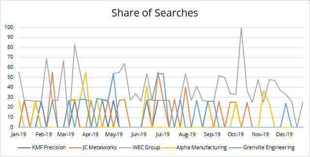
A replica of the Google Trends’ own chart:
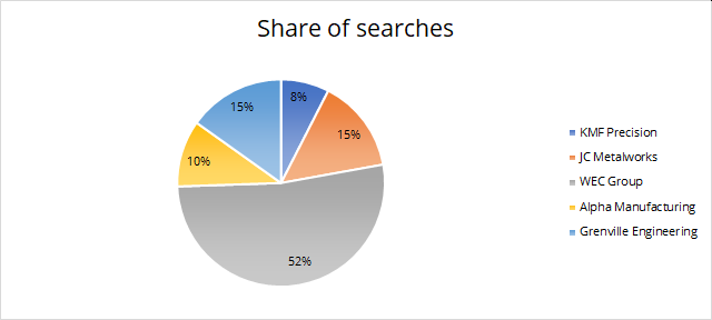
A summary of Share of Searches over the chart’s entire time period:
If you had sales data as well, you could see how long it takes for Share of Search to generate Share of Market but that kind of data costs more than most SMEs want to pay – and it’s not even available for many business-to-business markets.
Share of Search and Google Trends: the problems
Share of Search is an encouraging metric because it’s more accessible that its predecessor, Share of Voice (SoV). You needed advertising stats to calculate your Share of Voice and that data was hard to find. In ye olde days, you had to mortgage your children to buy it from Neilson or someone similar. In more modern times, the data just didn’t take into account the digital channels that contributed to your real-world Share of Voice.
So we certainly needed something new.
Les Binet suggests that we can all use data from Google Trends to find out how many people are searching for our brands in comparison to our competitors’ brands. He cites three great examples: cars, energy (gas and electricity) and smartphones.
But then the model starts to come apart. A bit.
Problem 1: data gaps
Unless you’re a big brand, Google Trends doesn’t give you all the data you need. It’ll come as no surprise that it has great data on smartphones from Sony, Apple and Samsung. We would also expect it to be able to report on cars from Skoda, Jaguar and Mercedes.
But if you move away from B2C (business-to-consumer) the data gets more patchy. And if you move into unglamourous niche markets, it throws up some curious results.
Let’s gets some ground rules out of the way. As you type a name into Google Trends it gives you two ways to look through what it finds: search terms or topics. When searching for brand names, Google’s own advice says you should use Topics. “Search terms” are interpreted far more loosely.
There are two hurdles to overcome with the data:
- Does it recognise the company name (brand)?
- Does it have any data for that brand?
I searched for 61 metal fabricators of various sizes; there were no results for 32 of them.
I searched for 23 security firms; there were no results for 13 of them.
I searched for 34 generator hire companies; there were no results for 14 of them.
So, on average, there were no results for 50% of the companies I looked for. Some of the missing names were big players in their industries so I wouldn’t be confident saying they’re missing because nobody searched for them. This is a problem for any analysis.
Problem 2: duplicate entries
Sometimes Google Trends will offer you several topics for the same phrase. Enter “Jewson” and you get lots of identical results. Why?
In this instance, it’s talking about different branches of Jewson, something that only becomes clear when you search for “Balloo Hire” – their results show the location names too.
Once you understand this, you have a further problem. In a Share of Search analysis you probably want to understand the prominence of the brand as a whole, not its individual branches. So you’d want to add all the branches up.
You can’t.
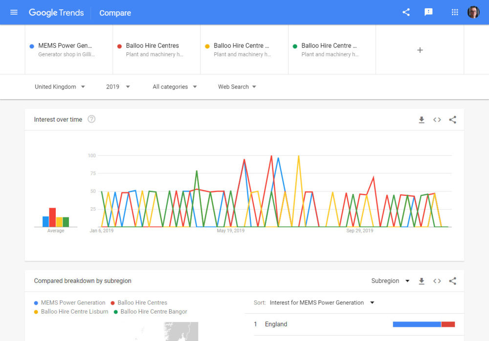
There are two problems. Firstly, the data Google Trends shows you is relative, not absolute. Look at the chart for searches in 2019. When you see the red line on the chart reaching 100 in about June, it doesn’t mean there were 100 searches for that term in June. It means that was the most popular search in 2019 and that it hit its peak in June.
Similarly, when the green line hits 50 in May, it doesn’t mean that brand received 50 searches in May. It means that brand received half as many searches in May as the most prominent brand received at any point in 2019.
Secondly, you can’t add the different branches up because the numbers are relative. 50 doesn’t mean 50 searches, it means 50% of the peak search volume. You can’t add that kind of number up.
Your work-around is to use the first entry in the list. Google Trends sorts them so the first entry is the one with the most searches.
Problem 3: only 5 entries per chart
Most markets have more than five players in them. You have more than five competitors you want to compare yourself against. You’d like your Share of Search report to be more extensive. But Google Trends only lets you chart five brands at once.
“No problem”, you think, “I’ll just merge the data from different charts. As long as they all have one common company on them, it’ll work.”
No, it won’t.
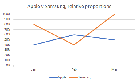
The problem is relative data again. Grab a box of paracetamol before you read on. You’ll need it. I have to use fictional data for this. Imagine you have one Google Trends chart for Apple v Samsung and another for Apple v Nokia:
Apple is a common denominator on both charts. Its January result sits at 40% against Samsung but 50% against Nokia. What you can’t see is that its number of searches is the same: 100 in my fictional data. Apple’s position on a Google Trends chart varies because 100 searches for it represents 40% of the highest number of searches on the Samsung chart (250) but 50% of the highest number of searches on the Nokia chart (200).
So far, so good. Take the paracetamol out of the box.
Remember, the only data we have from Google Trends is the relative data. We know the 40% and 50%, not the 100 searches this percentage represents.
Can you merge the Apple v Samsung and Apple v Nokia numbers and ‘normalise’ them? You could just take the Apple v Samsung numbers as they are then multiply the Nokia numbers by the difference between Apple’s number in that time period:
But this doesn’t work for at least one reason. You end up with proportions over 100%. There are probably several other reasons mathematicians are screaming about too, but one fault is enough.
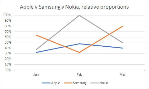
Even if you try rounding the numbers down so 100% is the maximum they’re still wrong. This method shows, for example, that Nokia had the most searches overall and that the peak was on February. But because I know what the real search data was in this fictional scenario, I know that the highest number of searches was for Samsung in March. That should be the highest point on the chart.
Time to take those paracetamol.
The upshot is this: there may be some way to merge data from different Google Trends charts but it’s probably beyond the mathematical skills of most of us. It’s certainly beyond me. We need to be confident about the reliability of any data we present. This level of statistical jiggery-pokery shatters my confidence.
So, it’s only safe to compare up to five brands at a time.
Problem 4: which John Smith?
Google Trends doesn’t always give you details about the search term it’s suggesting. Sometimes, it’s great. If you’re searching for a common company name it’ll tell you the type of business and its location. You can pick the right one:
Other times, it’s not so helpful. You can’t be 100% sure the Topic you’re about to pick is really the brand you’re looking for.
You can try adding “Ltd” or something similar to the end of the company but it could make matters worse, not better.
Problem 5: Search Categories
One way to exclude the ‘wrong’ John Smith would be to use the categories Google Trends offers you. Top-level categories include “Books & Literature”, “Finance” or “Business & Industrial”. If you pick the appropriate category (you can only pick one), you can exclude results for the wrong John Smith.
No, sorry, you can’t.
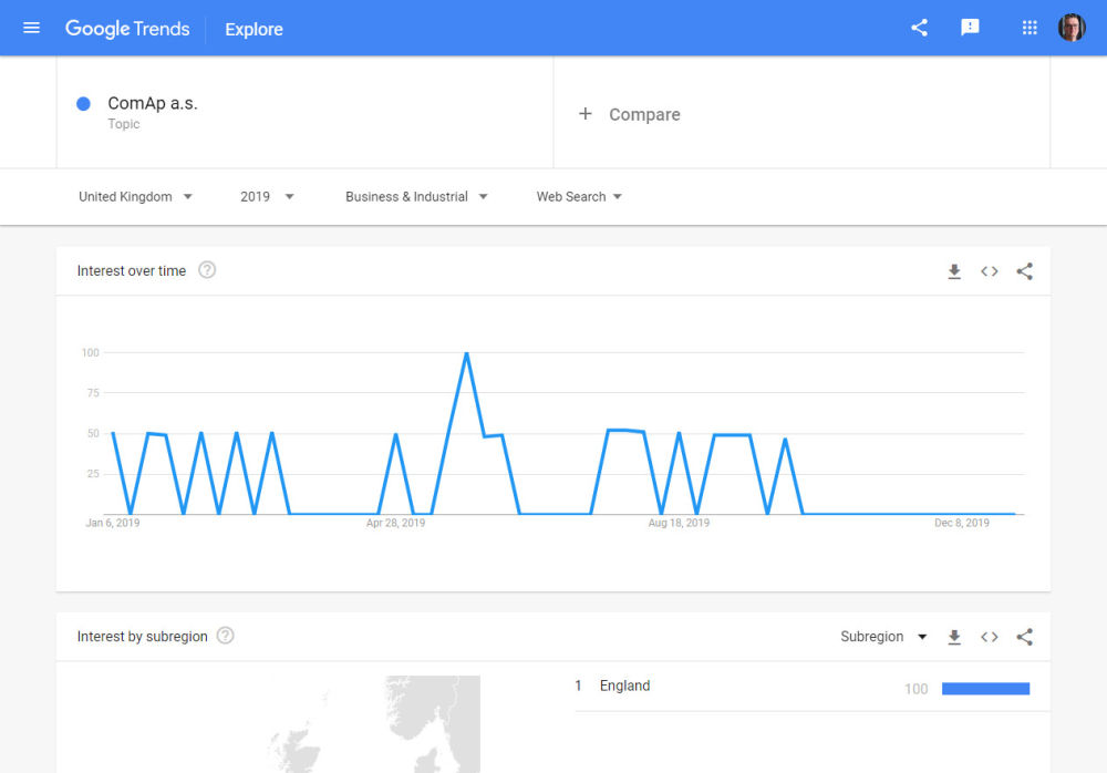
Categories don’t work as reliably as you would hope. For example, I searched for ComAp a.s., a company I’ve done a lot of work with in the past. They only sell business-to-business. There is no business-to-consumer arm. So ComAp’s results for “All Categories” and “Business & Industrial” should be the same.
They’re not. There’s some algorithm at work that’s skewing the results.
If you want to be confident of collecting all the search data for a brand, you need to use “All Categories”.
Problem 6: you may not want Share of Search
The final problems is with Share of Search itself. The concept relates to the prominence of the brand, not its prominence in a specific market. The generator hire companies I investigated are interested to know how prominent their brand is compared to other generator hire companies. You can’t always get meaningful data for that.
One of their competitors is Caterpillar, the global behemoth that produces dump trucks, marine engines and yes, you can rent a generator off them too. Google Trends has plenty of data on Caterpillar but it doesn’t tell you how many people searched for Caterpillar because they wanted to hire a generator.
You could get Trends data for “Caterpillar generator hire” but then you’d be comparing a search term for Caterpillar with a search topic for the other companies and that’s a big no-no.
Does this help Share of Search?
With all those problems, you might think Google Trends doesn’t help your attempt to calculate Share of Search. Far from it. It’s great. You just have to be aware of its limitations.
Let’s not forget that it’s free too. By all means, look carefully into this gift horse’s mouth. Just don’t punch it.
How should you use Google Trends data?
If you accept that your Share of Search indicates where your Share of Market is heading, your goal is clear: increase your Share of Search. Your target should be to “equal competitor x” or “exceed competitor y”. Google Trends data is all relative so you can’t say “reach 50% Share of Search”.
If you had sales data as well, you could see how long it takes for Share of Search to generate Share of Market but that kind of data costs more than most SMEs want to pay – and it’s not even available for many business-to-business markets.
When collecting brand data from Google Trends:
- Only collect data for search topics, not search terms.
- Do a preliminary search of all your competitors to get a feel for which are the biggest performers and which have escaped Google Trends’ notice completely.
- Use that search to create a single chart of your brand against four key competitors.
- Download the data from Google Trends.
- Paste the data into Excel template you can download from this page. It will automatically generate two charts.
A replica of the Google Trends’ own chart:
A summary of Share of Searches over the chart’s entire time period:

